 Information Architecture Challenge: Information Architecture Challenge:
Map a information flow of the out of the box experience for a SPARCstation 20 workstation. The map will be used to create documentation to improve the out of the box experience.
 Solution: Solution:
The user experience here is all prior to turning the system on. Turning on the system without first reading the software setup manual would likely destroy the ability to run the SunOS quick install and add a minimum of an extra half hour of setup time. We concluded the document must:
- be fully internationalized (all localization must be contained within a single version).
- clearly instruct the user read the next document (software setup manual) after hardware set up before powering up the system
- be short and concise and visual (after all, how quick is a quick-start requiring half hour of reading?)
- the information could be contained in three sections
- inventory
- set up (connecting the cables)
- options (non-essential ports whose cables may or may not be connected at this time)
 User Experience Challenge: User Experience Challenge:
Improve Sun's "out of the box" experience by creating a more readily understandable setup document. Design a fully internationalized short and concise quick-start document to enhance the out of box user experience for Sun's flagship desktop workstation. Confirm the document conveys the information with usability tests.
 Solution: Solution:
Using the information map, we internationalized the document (making it work in all locales). We borrowed from the consumer electronics industry's reliance on illustrated documents. What couldn't be conveyed using illustrations could be by using international symbols. We worked closely with Sun's L10N (internationalization and localization) team to research international symbols for the various connections. We ascertained the basic set up process was:
- unpack the boxes, optionally confirming the inventory of each
- confirm the power switch is in the off position
- connect the cables
- do not power up, but instead read the software setup manual
Testing confirmed our suspicions: the last step of this user sequence was not obvious. Many, if not most test subject wanted to power up the system in spite of warnings. We tested any number of variations of combinations of caution symbols and text, but each successive design failed in usability tests (usability test subjects invariably ignored the warning and assumed the next step was turning on the system).
 Visual Design Challenge: Visual Design Challenge:
Design the look and feel for Sun's first quick-start document for its flagship desktop workstation. Convey to the user NOT to turn on the system after hooking up all the cables.
 Solution: Solution:
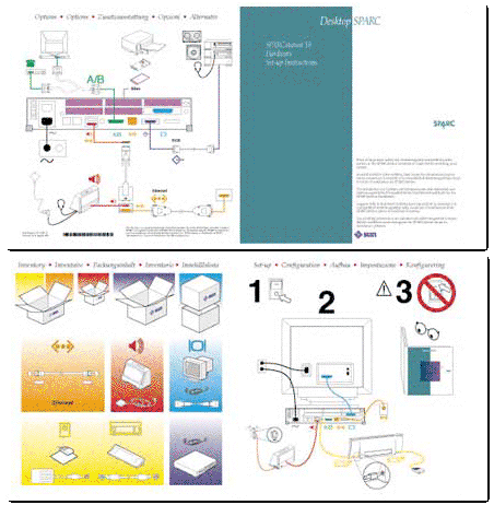
We started by trying to use illustrations whenever possible. It became clear illustration could convey most of the information with the combination of illustration and international symbols. This allowed us to condense what had been a 20-30 page document into a 2-sided 1-page folded fully visual card. We chose to reinforce these symbols with color, but also tested color-blind subjects to be certain the design did not rely on color. This combination of color coding and international symbols is now common in the hardware industry (even color coding cables and ports).
To solve the most challenging user experience challenge, we borrowed from the education industry. We used a highly visual 1-2-3 design and the international "NO" symbol to stop the user prior to power up. We designed a childrens-book style visual warning which was overwhelming successful (usability test subjects now asked why they couldn't turn on the system -- something covered in the software setup document).
Although this seemed completely counter to Sun's intellectual word-based culture, it worked.
Client: Sun Microsystems, Inc.
|