Information Architecture Challenge:
Assist and advise in mapping the information space for the International Assignees Solutions group web site This map will be used to design the user experience of the site.
 Solution:
Working with the IAS web team, we determined the following:
- Most of their information fell into five main sections.
- The audience was sophisticated and upscale.
- The site should emphasize the international aspect of this site
- Both visual design and information should change over time
 User Experience Challenge:
Design the user experience of for the International Assignees Solutions group web site. The information space will change over time, so the solution requires flexibility.
 Solution:
Using the navigational model, we determined the application required:
- a highly refined visual design
- visual clues to identify the site and company
- common element used as visual queues for location and links to other sections present at all times
Flexibility of visual design suggests using identifying graphics reinforced with a font and color scheme.
 Visual Design Challenge:
Design a flexible look and feel for the International Assignees Solutions group web site. Satisfy the requirements of the user experience challenge.
 Solution:
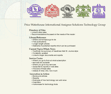
We experimented with Price Waterhouse logo and travel since this site is used to sell tools and provide information for people who are working abroad. We developed a travel metaphor using passport graphics. This site should be to the IAS customer what a passport was to a traveler. A passport represents the safety and privilege. A passport helps get you where you want to go.
We designed a a passport-like watermark using the Price Waterhouse logo for a background image. For the sectional navigation graphics we we designed passport stamp images. These act as visual locators while reinforcing the metaphor. In the center of each stamp is a graphic of a secondary travel theme.
The secondary theme was reinforced with a locator graphic. This graphic appears in the upper right corner when you are in a specific section. The initial theme we chose to use shells (to represent beaches around the world). We designed the graphics so the stamps could be easily updated using other themes (such as flora, fauna, ships, airplanes, holidays, etc.). We intended the continent names to be replaced by the shortened sectional names on the stamps themselves. These graphics could be quickly replaced with another set of stamps and passport background or even entirely different travel related metaphor like navigation (compass, sextant, etc.).
We delivered font and color schemes for various kinds of pages (static help, forms, etc.) for CSS so the application could remain consistent as it evolved.