 User Experience Challenge: User Experience Challenge:
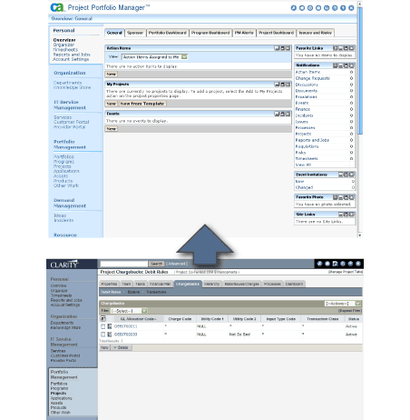
Clarity was a hugely complex and configuration intensive user interface. The user experience was perceived as outdated and difficult. This was largely because the system focused not on the user tasks, but on the system objects and their structure. The user navigated though an inconsistent UI from one object to another and back and forth during each task in order to achieve their goals.
Improvement in user experience for Phase 1 was limited primarily to improving themes. Themes as employed by Clarity were a look and feel skin at a server level. The application did not have themes available at a user level. User personalization was out of scope for this phase as were navigation model improvements, or any changes requiring a significant engineering effort (workflow enhancements, for example).
 Solution: Solution:
Apply CA UI Standards to a default theme for all new users. Product management insisted existing maintain their current default theme.
- Updated themes to reflect CA UI Standards.
- Kept modifications as in CSS when possible only modifying XSLT files when need to modify layout.
- Extended title bar across full screen width
- Added expand/collapse icon above the (left) navigation panel
Recommendations for further enhancements in next release:
- Consolidate navigation into one area.
- Allow the user to hide parts of it.
- Allow the user to modify part of it (rename, etc.)
- Include icons in themes. The ability to tweak icons when the background color and padding changes is key to a more flexible theme architecture.
- Greater user personalization in general.
- Greater use of user hide/show of UI elements.
- User themes. Allow for a modicum of personalization within each theme.
 Visual Design Challenge: Visual Design Challenge:
Design a new look and feel for CA's Project and Portfolio Management (PPM) software, Clarity. Bring Clarity close in line with existing CA UI visual standards without any changes requiring a significant engineering effort.
Clarity was one of CA flagship products, but still had the same color schemes and look and feel as it did prior to its acquisition. Color schemes and icons and navigation queues were all inconsistent with other CA applications. CA also began to phase out marketing of individual product line logos.
 Solution: Solution:
Designed multiple iterations of a new default theme for new customers and presented worked with product steering committee (senior management) for feedback. Updated graphics files, CSS and minimal number of XSL files to update the look and feel:
- Mapped icons, buttons, fonts and color to better align Clarity to other CA products look and feel
- Created a default theme
- Extended title bar across full screen width
- Added expand/collapse icon above the (left) navigation panel
- Allowed for longer product name by moving rarely used document search into global navigation icons
Client: CA, Inc.
Application: Portfolio & Project Management
Users: Project Managers, Corporate Management
Usage: most users are unlikely to use this system on a daily basis. |