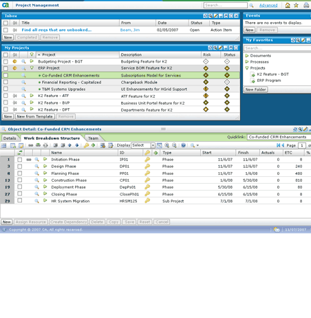
 Information Architecture Challenge: Information Architecture Challenge:
Clarity was a hugely complex and configuration-intensive user interface. The user experience was perceived as outdated and difficult. This was largely because the system focused on the system objects and their structure rather than on user tasks. The user navigated though an inconsistent UI from one object to another and back and forth during each task in order to achieve their goals. This typically resulted in the user losing context and feeling like there are too many clicks.
 Solution: Solution:
We determined navigation was the top pain point as the most common user complaints were "too many clicks" and losing context. To a simplify the navigational model:
- Created multiple user personas based on the most common types of Clarity user (project managers, financial managers, corporate management, team members, etc.)
- Worked with pre-sales, internal users and product management to construct user scenarios using the personas.
Began moving Clarity from an object-based interface to a modern task-based interface.
 User Experience Challenge: User Experience Challenge:
Design the user experience of the next generation for Clarity, CA's Project and Portfolio Management (PPM) software. Modernize a UI that is perceived to be outdated. Begin to move from a object-based interface to a task-based.
The user experience was perceived as outdated and difficult. This was largely because the system focused on the system objects and their structure instead of focusing on user tasks. This resulted in Clarity having a hugely complex and configuration-intensive user interface. The user navigated though an inconsistent UI from one object to another and back and forth during each task in order to achieve their goals.
 Solution: Solution:
We created mockups of stream-lined workflows using personas and scenarios. We refined these mockups over successive iterations by validating them with stake holders and users. This resulted in:
- Consolidated screens
- Addition of web 2.0 features
- Added a multiple panel interface so the user wasn't constantly navigating to view and edit details
- Added drag and drop in tables and for screen panels
- More extensive use of expandable/collapsible screen sections
- Introduction of User Personalization (as opposed to configuration)
 Visual Design Challenge: Visual Design Challenge:
Design the look and feel for the next generation for Clarity, CA's Project and Portfolio Management (PPM) software. Update the 1990's looking look & feel to a modern web 2.0 look and feel.
 Solution: Solution:
Designed multiple iterations and multiple versions of a modern interfaces. Radically changed the "navigate to anywhere at anytime" interface which lacked the ability to personalize or hide any of these navigation links. Replaced the page layout interface with an interface with an application look and feel. Themes allow this look and feel to change dramatically upon a trigger a switch.
- Updated look and feel
- Updated color scheme and branding to match corporate brand refinements
- Looks "more web 2.0"
- More extensive use of themes (greater flexibility in what can be controlled by themes)
- Use less screen real estate for navigation links
- Removed visual clutter of seeing 5 levels of navigation at once
- Allow the user to hide tabs and other navigation they don't use
- Simplified branding areas (common for Clarity customers to re-brand the application with their own branding)
Client: CA, Inc.
Application: Portfolio & Project Management
Users: Project Managers, Corporate Management
Usage: most users are unlikely to use this system on a daily basis. |